Hey Kids! Red’s Not a Primary!
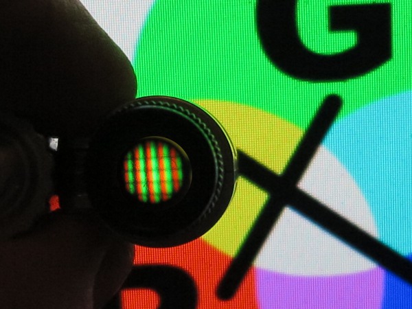
Red and Green make Yellow? Counter intuitive? Examine a yellow patch of your monitor with a magnifier (or place a drop of water on it). You’ll see red and green dots!
That’s right! It’s a primary for light but not paint.
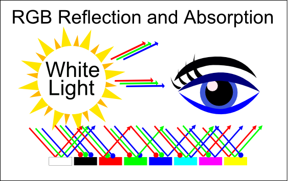
The red, green and blue circles (below and right) show primary colors for your eye. The additive RGB system reflects human physiology since we have receptors corresponding to those three experiences (aka L, M and S for long, medium and short).
Secondary combinations are cyan (GB), magenta (RB) and yellow (RG) and all three (RGB) make white.
The Venn (below right) shows subtractive primary colors cyan, magenta and yellow. Secondaries are red, green and blue (deja vu?) and all three make black. The CMY system is based on absorption and reflection of light (further below).
Notice the secondary colors of the additive system are the primaries for the subtractive system. Also the secondaries of he subtractive system are the primaries for the additive system.
Additive is used in displays and lighting. Subtractive in printing and painting (explained below).
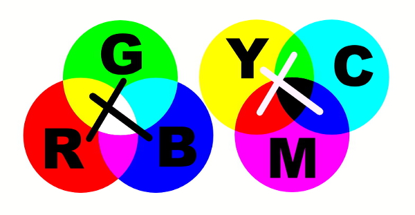
Color Venn Diagrams: Primaries for your eye (left) and for objects (right). Also known as additive and subtractive color systems.
Crosses (above) indicate red and green as opposites (as are yellow and blue, explained below).
The way the diagram is arranged, if you start at red and move around clockwise on either system you get red, yellow, green, cyan, blue and magenta.
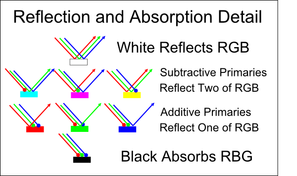
Also the three colors CMY seem lighter than RGB since each of CMY stimulate two eye receptors and each of RGB stimulate one receptor type (diagram and explanation further down).
What about Red, Yellow and Blue?
The RYB color system was developed some time ago and it doesn’t give as many color possibilities as CMY. It’s still widely taught despite limitations.
 Magenta and Yellow Make Red
To illustrate that red is not a subtractive primary (right), I am using yellow and magenta to make red (also orange from the red and yellow).
Most artists will keep red paint on their pallet anyway to save time. Also the red pigment may have different properties than two pigments mixed into red.
Another example of having more colors on the pallet is CMYK printing (K refers to black although it stands for “key”). Mixing CMY gives a muddy black because of imperfections of the paint/ink. So they include black developed from different pigments. It yields better black and saves ink.
Here’s a typical example of an artist using the archaic Red Yellow Blue (RYB) system. Here “violet” comes as mud and she can’t make good green either.
This video is a bit past the kindergarten naivety from above since he uses two versions of each pretend primary which improves the situation.
Split Primary System
In fact cheap paint kits that use the RYB system will have two versions of each “primary” to try and improve on this problem. They contain a “warm and cold” version of each one using six primaries. This is often called the “split primary” system.
Professional artists will use the CMY system since it is more accurate and varied. Example John Muir Laws.
How Does RGB Work?
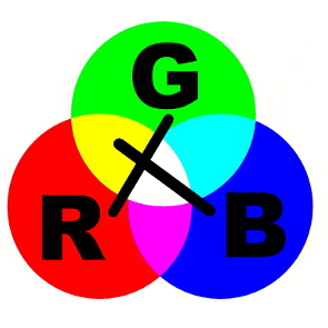
Additive mixing works with colored light. If you shine a red and a green flash-light you expect a red and green spot (on a white surface). Any overlap will be yellow. So the RGB Venn above shows the color yellow between red and green. It’s called additive since when we add the second flash-light we add a stimulus to your eye. Yellow is a more luminous color since it is a combination of stimulus from two colors. Shining a third blue flash-light into the mix makes the color white which is the most luminous color because all three of your color sensors are stimulated. The RGB Venn diagram above actually shows the three spots of the flashlight overlapping. If you shine white light through a prism, it can be divided back up because each color is bent a different amount by a prism.
 RGB and Computers
Most computer systems (and some computer software) use a notation system for RGB color. The system uses three numbers to denote the amount of red, green and blue respectively. There is typically 256 levels for each color. So each of the three numbers is from 0 to 255. So the color red would be (255,0,0). That’s 255 units of red, zero green and zero blue. Green would be (0,255,0) and blue (0,0,255).
If you have a look at the RGB Venn diagram you can see the color combinations for the secondaries. For instance magenta is red and blue. So the color notation would be (255,0,255).
All three primaries of light mixed with maximum intensity gives white (255,255,255). And having zero of each color of light (0,0,0).
Any combination where the three primaries of light are equal but less than 255 are shades of grey (128,128,128), (64,64,64) would be examples.
There is a slightly abbreviated hexadecimal notation (aka Base 16). We are used to using the digits from 0 to 9 to represent number, adding another place when we run out of unique symbols. With hexadecimal we use 16 unique symbols rather than 10 so you can represent bigger numbers with less places. It uses 0123456789ABCDEF as it’s unique symbols. With this system the familiar number 255 is expressed FF. Conveniently that is just two positions rather than three. Of course zero is still 0. It is common with this method to pad number so they always use two positions so zero could be 00. So hexadecimal color no longer require comas between them since we know each of the red, green and blue values is always two characters.
So red would be FF0000. Black would be 000000. Just to make sure we don’t get confused hex numbers often have a # symbol (some systems us 0x) in front of them. Using this prefix green becomes #00FF00 and of course blue becomes #0000FF. This is more efficient and convenient.
A notable system that uses this notation is HTML. If you visit any Web page and “View Source” to see the HTML that is rendering the page (right click and choose view source from the menu), you will see all the HTML codes that make up that page and you may encounter the various color codes for that page in hexadecimal format.
There are other color notation systems but this is very common and works well.
There’s No Magenta Wavelenth
Another thingk worth noting is that light has a wavelength or frequency (like sound). More details on this below. Different wavelengths give different color experiences. The image below (from Wikipedia) shows the visible spectrum and what colors they correspond to. Magenta is missing.
You experience magenta when your red and blue receptors are stimulated (but not your green).
RGB LEDs
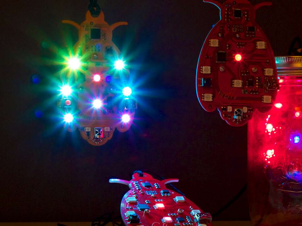
Firefly which is a light project.
Many artists and engineers use LEDs (light emitting diodes) in their work. One could use red, green and blue LEDs separately and then mix the color somehow.
Or RGB LEDs can be purchased. Those are LEDs that have built in red, green and blue (three LEDs in one). Popular part numbers are WS2811, WS2812B. Adafruit NeoPixel uses WS2812B.
For those systems it is common to use the notation (r, g, b) or 0xRRGGBB depending on what system is controlling the lights.
HSI Notation
Because LEDs are very physical a few limitations of RGB often come forward so the HSI notation came forward (Hue, Saturation and Intensity). For this system hue is a number representing where the color is on a color wheel (either in degrees or radians). Intensity is a number representing the intensity of the color.
This system can be handy because it separates the color perception from intensity. So if you wanted to make red of different intensities you could vary just intensity as a parameter rather than varying the three parameters red, green and blue.
There is a great function for making a conversion by Brian Neltner that works with Arduino microcontrolers (HSI to RGB).
Also see HSL and HSV.
How Does CMY Work?
Subtractive mixing is for mixing paint and pigments. It’s called subtractive since paint absorbs or subtracts colors. The more colors of paint you add, the more colors are absorbed or subtracted and the darker the color.
If you shine white light (which has red, green and blue content) onto red paint, the red paint will reflect the red but absorb the green and blue. It’s subtracting everything except red. And it feels like the paint is emitting red light since that’s all that’s being reflected from the white source.
Of course something similar is happening for green and blue. One of the three is being reflected and the rest absorbed.
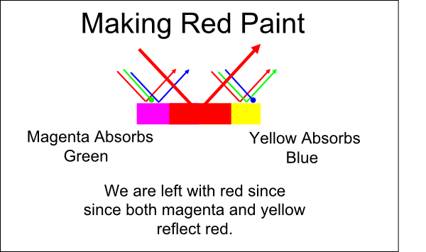
Now the fun starts. Yellow paint is reflecting red and green but absorbing blue. Cyan reflects green and blue but absorbs red. Magenta reflects red and yellow but absorbs green.
That’s why magenta and yellow make red. If yellow absorbs the blue and magenta absorbs the green, we’re just left with the red which they both reflect. Don’t panic, diagrams below.
If you mixed the three colors cyan, magenta and yellow, all the colors in the white light will be absorbed leaving black. Each time we add a paint color to the mix we are subtracting more color since less is reflected. Each paint absorbs some color.
In the following diagram, all the white light is red, green and blue but the objects take on different colors because of what they absorb and reflect. We only see what’s reflected.
The same diagram broken out more (below). I’ve shown the darker colors towards the bottom. In the subtractive Venn diagram, the darker colors are towards the middle. You can see that CMY is brighter than RGB since it reflects two of the three additive primaries.
In my example of mixing red paing from magenta and yellow above here is what was happening.
Human Perception
Your eyes have other features (aside from the ability to detect color). The human eye has differentiation and integratiton built in that perform task like interpreting color based on context.
Here is a video touching on that. {video missing}
Black and White are Colors
A lot of people like to say that black and white are not colors.
Consider the additive-RGB system. White is the combination of Red, Green and Blue. If you pick any two of those colors you get Cyan, Magenta and Yellow. If picking two colors makes another color why wouldn’t picking three?
Consider the subtractive-CMY system. Black is the combination of Cyan, Magenta and Yellow. Combinations of two give Red, Green and Blue. Same argument as above. Mixing three colors gives another color.
What value is there in saying that all combinations of the primaries make a color except all three or none of the three? It’s about as useful as excluding zero from the number line because it feels more abstract.
What About Color Opposites?
The little crosses on the color charts above is related to the wiring of eye receptors. Because of the overlap of your three types of sensors, your eye sends comparisons to your brain instead of absolute signal. This the opponent process. I found that wiki article a little unclear so here are some better diagrams.
If you have a look at the left triangle you can see that it has red connected to positive and green to negative. So if the receptors receive red and green in equal intensity, it actually cancels out for the left triangle. The second triangle has red and green (yellow) connected to the positive and blue to the negative. So the brain receives these differences rather than the raw signals coming from the receptors.
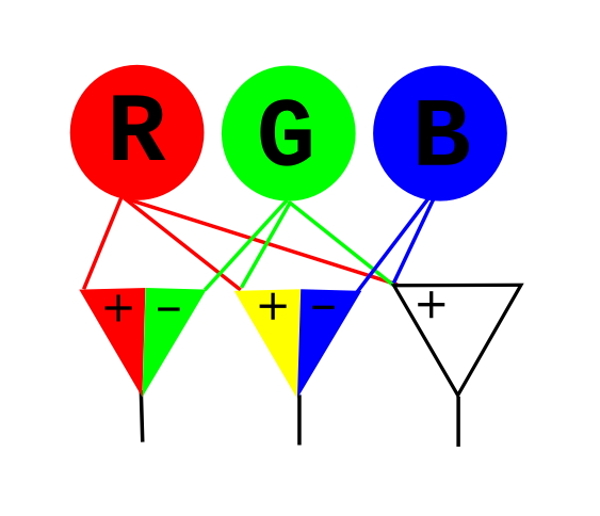
This is also why the most common color blindness is red-green and yellow-blue.
Practice of Mixing Paint
Color theory is one thing but then there’s practice. Paint you buy may not have pigments that match the mentioned colors. They may have various colors in them. Most of the pigments that are commercially available will not offer a wide gamut of color possibilities. They may even use more than three primaries. Such as the Hexachrome system which adds orange and green CMYKOG.
Here’s an example of making green from different colors.
The History of Blue
Non Pigment Color
This is also known as structural color.
The Animal Kingdom
Most mammals have dichromatic vision. They are a bit like a color blind human (although there are numerous kinds of colorblindness).
Most old world primates are tri’ and most new world primates are di’.
Humans have Trichromacy which means our color experience comes from three different sensors (red, green and blue). We have a lot of anomalies (called color blindness) and even a few possible cases of women having four color sensors. These rare women with tetrachromacy have a superior color perception.
Tetrachromacy
 This is possible with four sensors types.
Various fish and birds have tetrachromacy and further some can see outside the human visible spectrum (into ultraviolet).
I’ve drawn the RGB Venn diagram to the right in a way it can be merged with a fourth primary color. For some birds and insects this fourth color is ultraviolet. In rare tetrachomatic humans this is a sensitivity to color somewhere between green and blue. I’ve called it Gbeen or Tetra. It is shown as grey in the diagram because most humans can’t see it.
The standard Venn diagram for color has seven colors. Red, green, blue, cyan, magenta, yellow and white. The Venn diagram based on four primaries has fifteen colors in it. The seven we know of and eight more which are the 4th primary a tetrochromate sees and seven more which are the combination of that primary (Gbeen) with the initial seven.
They would have a white which is brighter than the white consisting of just red, green and blue.
Meet the Mantis Shrimp
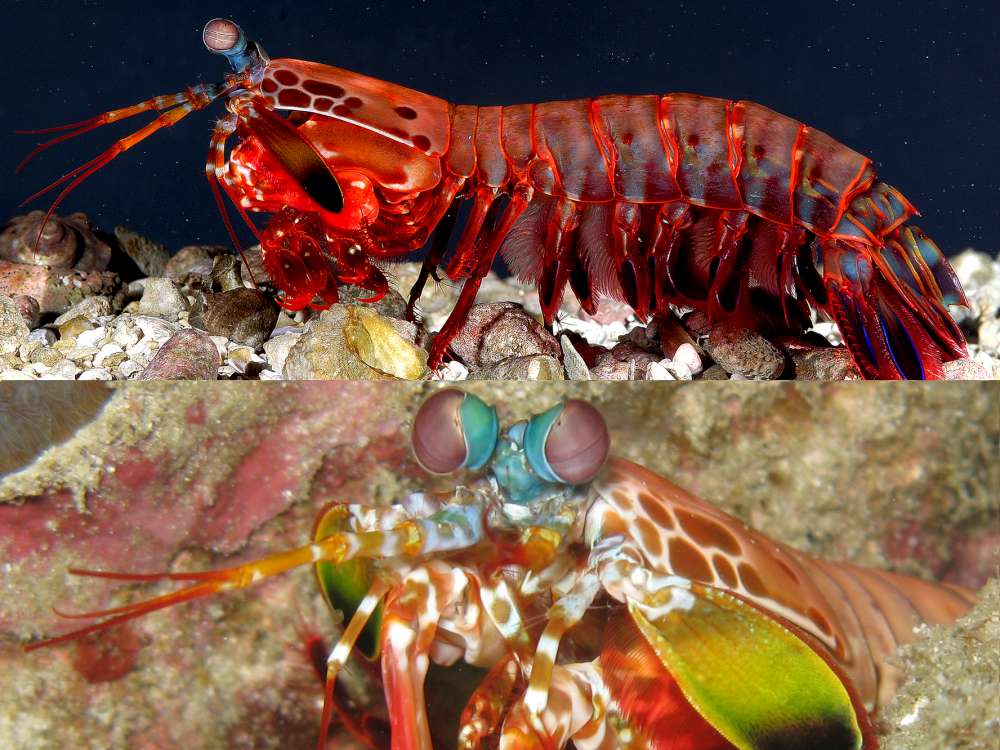 The mantis shrimp is an unusual creature since it has twelve different color receptors! Also four others (totaling 16) for other features of light such as polarization.
It can differentiate light has been reflected from light that has not been reflected. It can detect circular polarization.
The mantis sees ultraviolet colors that we can’t see. They also fluoresc colors they can see (that other animals can’t see). So this could be part of mate selection, kin recognition and other social differentiation.
Many mantis shrimp also have a unique ability to break through aquarium glass.
 Dragonflies
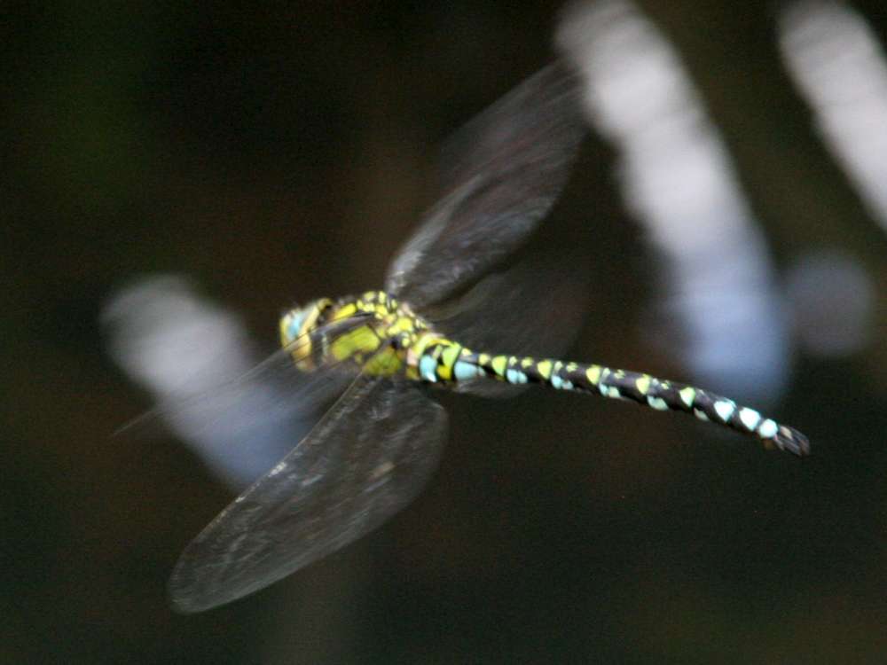
Dragonflies have from 11 to 30 different color sensors.
They see into the ultraviolet range plus it is thought they can detect polarized light.
Also the number of sensor types varies with age.
Article in New Scientist.
The Blue-Black or Gold-White Dress
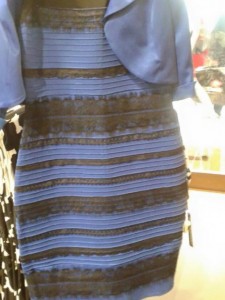 This has been an explosion of talk about color and perception.
If you studied up on color and perception you’d know that this dress phenomenon is because of an ambiguous context (as is mentioned in the video below).
But for extra thrill value, adjust your monitor brightness while viewing the image and see what happens.
Surprise! A factor here could be people’s preferences for monitor adjustment. Not to poop on the context and perception angle. It’s relevant too but try not to get all analytically about people who subscribe to either color scheme.
Color Blindness in Humans
Humans are trichromates but anomalies occur where one or more color receptor is not working or not working fully.
Here’s a recent viral video of a person experiencing color differently. I suspect that this person is not “color blind” but instead their color sensors overlap and the glasses filter the overlapped portion of the spectrum.
What’s Light in the First Place?
Light is a wave of electromagnetic disturbance. Okay, that didn’t help so lets ignore that for a second (also ignore particle-wave duality and all that physics oogabooga). Let’s liken light to a sound wave for a moment. You strike two sticks together such as the clave below and a wave of sound is emitted. The wave travels through the air and eventually reaches your ears where its processed into an experience. Sound is a mechanical disturbance. The stick is physically vibrating at a various frequencies (but mainly at one) and is vibrating the air.
For a piano a hammer strikes the music wire causing it to vibrate at various frequencies (each wire having a main frequency).
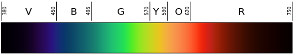
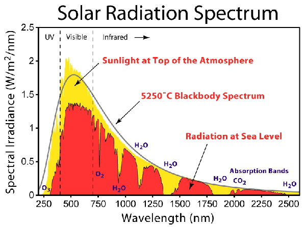
Light is actually a type of wave except it’s not mechanical its an electromagnetic disturbance. Instead of coming from a mechanical vibration it comes from acceleration of a charge such as an electron (when they change state). It also has a frequency of vibration. A given burst of light can have lots of different frequencies of vibration because the causing disturbance can be at more than one frequency. Or there could be more than one source. Sunlight contains a wide range of frequencies. Here is a diagram I grabbed from Wikipedia showing the different frequencies in sunlight (it’s labelled in nanometres). The frequency of light is often measured in Hz (cycles per second) and wavelength (any distance measurement).
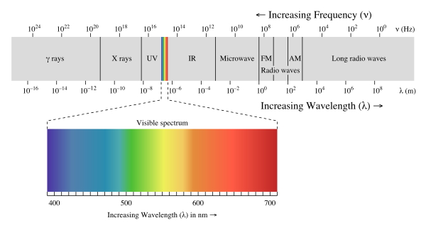
The different frequencies of light have different names. Here’s a diagram for that (Wikipedia).

Response of your eye to different wavelengths of light in nanometres.
The human eye only responds to three specific frequencies of light. The cones of our eye that sense the light are called L, M and S for long, medium and short. In this case they are referring to the wavelength of the light which is related to the frequency. These three cone types give you the experience of red, green and blue. Here is a diagram (Wikipedia) that shows the different frequencies each receptor responds too. As you can see each one responds to a range and there is overlap. So if there was some light around 600nm, then it would stimulate both the red and the green receptors. You’d actually experience yellow since red and green make yellow according to the first diagram in this article.
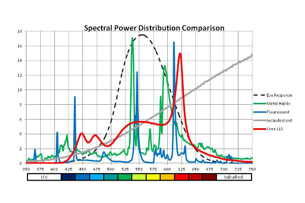
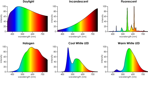
Different light sources actually have different content of frequencies of light. Here’s a diagram of the content of a few common sources. As you can see some sources such as fluorescent have a higher content of some frequencies of light. This can have an impact on the color experience. Here are a couple of diagrams.
Also pigments or paint may not be accurate and may not behave well. So this can make it difficult for artists.
Related
Examples of human tetrchromacy. BBC, Popular Science
John Muir Laws water color demo of color mixing.
Magenta ain’t a color.
271 Years Before Pantone, an Artist Mixed and Described Every Color Imaginable in an 800-Page Book
Art and Color Systems
Some artists deliberately work with a limited pallet of color. For instance many photographers work with black and white even though they have technology to make color.
Also light sources and pigments are not that predictable so can be a difficult problem.
Grisaille is a 16th century technique using a narrow pallet. Because of the narrow pallet, this technique avoids the issues of pigments and light (to some extent) and is a great technique for creating 3d experiences. Especially with sculpture since it is already usually mono color.
Chiaroscuro (or Tenebrism) is another interesting technique. With Chiaroscuro, the artist uses a great amount of contrast. The background is very dark and the foreground is very bright. Be sticking to these two extremes, the subject of the painting becomes very clear. It also decreases the demand on the palette since everything is very dark or very light. Less concern for shadows and other challenges.
Sfumato is a technique that blurs the areas of bright and dark so that it appears foggy (in a sense). This is another method of removing certain details to make things more realistic.
Pointillism is a technique of adding little dots of paint adjacent to each other rather than mixing the paint. Pixelation is a related technique employed by Chuck Close.
Color Constancy: Wiki
Tetrachromacy article.
- Science Education Foundation
- Handprint.com the best color information on the web (also see the discussions of individual watercolor pigments)
- Smashing Color
- Midimagic
Here’s another article suggesting a palette of:
Hansa Yellow Light
The cool yellow
Hansa Yellow Medium
The warm yellow
Naphthol Red Light
The bright, warm red
Quinacridone Magenta
The cool red for pinks and violets
Anthraquinone Blue
The warm blue
Phthalo Blue (Green Shade)
The cool blue
Phthalo Green (Blue Shade)
The cool green
Titanium White
The tinter
Hi John, thanks for the comment. Glad you like the post.
This is the nexus of art and science- a really helpful post! Thank you for a scientific and artistic look at color. I do all my color mixing with watercolor with Cyan, Yellow and Magenta. Keep up these great posts.